Graphical methods includes boxplots, stem and leaf plots, scatter diagrams, pattern and trend analysis, histograms, normal probability distributions and Weibull distributions. This article describes each of the effective ways to graphically represent data, maximizing it for information. Toward the end of this article, you’ll be able to download a handy guide/flowchart that provides helpful tips on what type of chart will be helpful, given the type of data that you have.
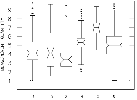
The Boxplot
The boxplot is a number summary of the data. The data median is a line dividing the box. The upper and lower quartiles of the data define the ends of the box. The minimum and maximum data points are drawn as points at the end of lines (whiskers) extending from the box. Notches indicate variability of the median, and widths are proportional to the log of the sample size.
Stem and Leaf Diagram
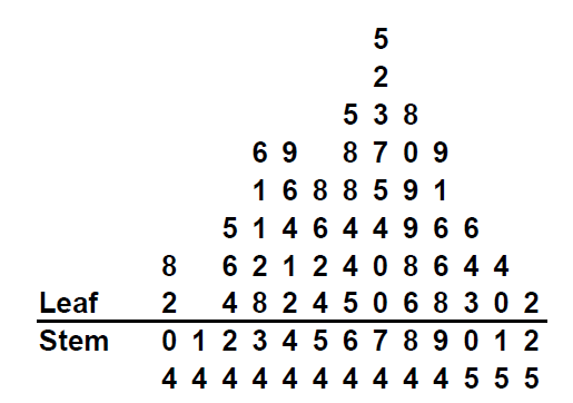
The stem-and-leaf diagram is a convenient, manual method for plotting data sets. The diagram consists of grouping the data by class intervals, as stems, and the smaller data increments as leaves.
View this example of a stem and leaf diagram.
Scatter Diagram (Scatter Plot)
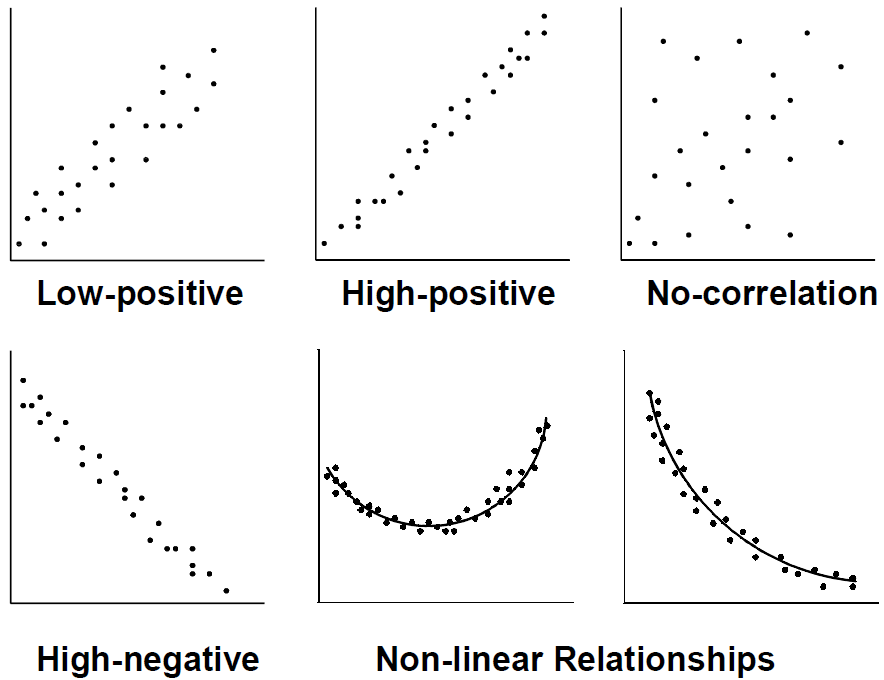
A scatter diagram is a graphic display of many XY coordinate data points which represent the relationship between two different variables. It is also referred to as a correlation chart. Scatter diagrams can help determine if a relationship exists and how to control the effect of the relationship on the process. In most cases, there is an independent variable and a dependent variable. By tradition, the dependent variable is represented by the vertical axis and the independent variable is represented by the horizontal axis. The dependent variable can be controlled if the relationship is understood. Correlation originates from the following:
- A cause-effect relationship
- A relationship between one cause and another cause
- A relationship between one cause and two or more other causes
Not all scatter diagrams reveal a linear relationship. The examples below definitely portray a relationship between the two variables, even though they do not necessarily produce a straight line. To use scatter diagrams, you must be able to decide what factors will best control the process within the specifications.
To help you get started, download this Guide to Choosing a Good Chart, which is a very helpful document for graphically representing data.
[contentblock id=16]


Comments are disabled for this post.